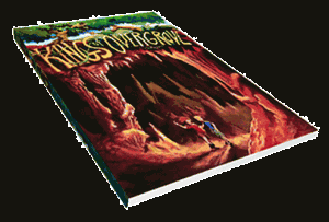
 I found Kings of Overgrove through twitter (@
KingsOvergrove) while looking for other independent comic book creators. Kings of Overgrove caught my attention because the creator is giving away half his graphic novel for free. He also created a motion comic he published on YouTube.
The Website
What I love
From the first look at the website, we can tell that Kings of Overgrove is special. The site has a great design that reflects the story, is easy to navigate, promotes the viewer to share the site, and allows for comments. You can’t ask for anything more from a website. It looks great and it does its job!
For those of you who read this blog for my articles on Internet Marketing for Artists or are starting your own online comic book, you can probably learn a lot from this site. If you’re putting together your online portfolio, promoting your project, or publishing an online series this is a great website to explore before creating your own.
Reading the Comic
I love the software he uses for reading the comic; it gives the viewer the feel of reading a physical comic book.
This is what I like about the readability of the comic.
- Get a full two page spread
- Page turns when you click on it
- You don’t have arrows on top of artwork
- You don’t have to scroll down
Other things I enjoy about the Site
- The interview of Arel Herbrand (creator) gives a personal touch to the graphic novel
- It is easy to share the first half of the graphic novel using social media
- Simple web design with only 6 web pages
Website Flaws
Even with this great looking site, there are a few thing I would change.
Have continual updates
Having a static website is fine if you just want people to come to your website once, read the content, and leave. If you want people to return you need to give them a reason. This means having regular updates with new content and, more importantly, letting the viewer know more content will be coming and they should check back or sign up for the RSS feed.
For a site like this it is harder to have continual updates because it takes a long time to create each page. The solution could be to add a behind the scenes blog or a little more content relating to production of the comic and/or motion comic. It would be a great way to keep fans coming back to the site, catch the eye of other comic book creators, and help get better SEO ranking in Google.
Make the site more smart phone friendly
I was happily surprised to find the site allowed me to view the graphic novel on my iphone through the website. The only down side was the controls were small and it loaded a little slow. This is not a kingsofovergrove.com design fault since they didn’t create the software for reading the comic. My guess is that there is a solution out there, but it would be expensive and/or time consuming. NOTE: I only tested it on my iphone 3G, it might work better on a new smart phone.
One thing they could have done to make it more smart phone friendly would be to add links at the bottom of the pages. When I view websites where the links are integrated into the banner viewers have a hard time telling they are links and a hard time clicking on them if they are small. By putting simple text links at the bottom of the page it would make site navigation a little easier with the phone.
The Graphic Novel
You can purchase the comic book through the website at http://kingsofovergrove.com/store/ or you can read the first half of it on the site at http://kingsofovergrove.com/childrens-kids-graphic-novel/.
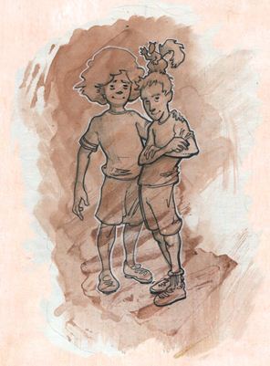
It’s a story about two brothers with different strengths who find themselves on an adventure to save their grove from dying. During their travels they meet a variety of strange characters; most of them helpful… if only for their own reasons.
The art style is amazing. It has a “Disney” feel to it.
The Motion Comic
As a way to reach more readers, the creators of Kings of Overgrove made a motion comic of the Graphic Novel. This is a great idea! Not only can they catch some of the search traffic on YouTube, but it is a great way to introduce people to the story who may not want to take the time to read.
The only complaint I have for the Motion Comic is that is feels a little slow. I think this can be blamed on the fact the motion comic was a spot on adaption of the graphic novel. Smart move, but with the very limited animation of the motion comic and the back and forth nature of dialogue in comic books made the video a little choppy which makes it fee “drawn out”.
I have to say the voices of the characters were Amazing. As someone who has created a motion comic that didn’t have voice over work I know that people get annoyed by having to read speech bubbles in videos. The voice actors and the audio quality are perfect.
Your Turn
You should check out http://kingsofovergrove.com/ and let me know what you think.
Thanks and have a wonderful day.
Jason Love

Stay Up-to-Date
Get Post Updates via (Email / RSS)
Join the Mailing List
To get exclusive content related to the guests on the podcast, webcomic news, online tricks, social media tips, and lessons on being a digital media alchemist; sign-up to the newsletter.
Search
Some Cool Stuff!
Historical NonSense