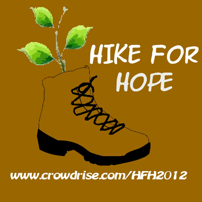
My friend loyal just finished his adventures Hike for Hope. The point of posting this is not to promote his efforts (but feel free to help by visiting http://www.crowdrise.com/hfh2012), the point is to demonstrate good use of imagery for an amazing logo. For me I use a 5 steps process to ensure that I am covering my basis with a proper logo design.
This is a case study for my early post on how to create a log with meaning.
The 5 steps are:
1) Get into the mind of your customer:
I met loyal once before working on this logo for him and picked up several things about his personality just from chatting during coffee. First, he was dressed in a “casual outdoors-man” . He had on pants that were comfortable and could take wear. The color was a light brown. He wore a black t-shirt, but I can’t remember what was written on it. He had a bit of stubble.
Taking in all this information I created a list of does and don’ts about his logo.
Do’s:
- Earth tones are good
- Simplicity is good
- Needs something that is emotional
- Over due bright colors
- Clutter the image with too much detail
- Focus on current trends
2) Goal of the organization/idea the logo represents
Next I talk to Loyal about the goals of his organization through facebook messages. He just sent me to his crowdfunding page for more information. You can check it out at: http://www.crowdrise.com/hfh2012
Things I took from the page:
- love for adventure
- burning desire to help those in need
- international
3) What images best represents those goals
I broke the logo down into two messages at the same time.
- Adventure and Travel: For this my list of images were a globe, a plane, hiking boots, backpack, and a compass
- Hope: For this my list of images were a heart, a sapling, a child’s hand, baby foot print, and two people embracing
4) Color pallet of logo
I wanted the color pallet to reflect what I saw as Loyal’s personality. He has a lot of energy, but it is very grounded. I decided to go with earth tones such as browns, greens, tan, gray, and black.
5) Find what images with the color pallet best fits
As soon as I picked the color pallet the logo image popped into my head. It was to be a sapling growing in a boot. I quickly sketched up a rough draft and sent it to Loyal.
The client’s reaction
He instantly loved the rough draft. When I told him I had to do some clean up for the final copy he said, “I thought that was the final copy”. As you can see from the image above, I left some of the rough look of the original rough sketch, but went over it in illustrator to make everything look better.
Your Turn
I hope this article helped you see my process and will help you with your logo creation. If it is for your own business or a clients, I find going through these steps helpful. Do you have any logo creation stories you would like to share? Feel free to leave your response in the comments below.
Thanks for reading,
Jason Love

